26 Oct
[ad_1]
Ever since I started to learn how to code, CSS has excited me. As a very visually rewarding style sheet language, it has always been an instantly gratifying language to work with.
The CSS landscape at the moment is ever-changing. There are many new features that have been released recently, so I thought I’d have a look around and summarise those that caught my eye, concisely in this post.
As with many fun new things to play with, browser support on some of these (at the time of posting this) is fairly limited. I’ll make sure to outline these alongside each of the features.
Container Query Length Units
At the dawn of CSS, we were blessed with the classic pixel units (px). Then came along the relative units we are all familiar with (rem and em) and more recently, vh and vw, which gives us the power to set our elements’ length based upon the user’s viewport height and width. But very recently it was announced that CSS is to get another unit of measurement, that is Container Query Length Units.
If you hadn’t heard of them until now, container queries are similar to media queries. However, instead of being based upon the size of the user’s viewport, the styles can be changed according to the size of one of the element’s parent containers. Now in the same way that vh and vw are relative to the size of the viewport, container query units are relative to the size of their container.
Currently (I’m saying this as it’s still in draft), the proposed units are:
- cqw (Container Query Width) – 1% of the container’s width
- cqh (Container Query Height) – 1% of the container’s height
- cqi (Container Query Inline) – 1% of the container’s inline size
- cqb (Container Query Block) – 1% of the container’s block size
Then we have two bonus units that are:
- cqmin (Container Query Minimum) – the smaller value of cqi and cqb
- cqmax (Container Query Maximum) – the larger value of cqi and cqb
You can keep track of the progress of this in the CSS spec here.
Browser Support
Container Query Length Units units are only currently supported within an experimental flag in Chrome Canary, so if you want to try it out, make sure to enable it by opening up your chrome flags, searching for ‘Enable CSS Container Queries’, and checking the checkbox.
Flexbox Gaps
Now you may have already come across the gap property in CSS, but very recently this has been upgraded to not only work with CSS grid but also flexbox.
Gaps are most commonly used in grid layouts, to introduce consistent spacing between rows and columns (and therefore items) within the grid. This translates over to flexbox in a very similar way. Gone are the days of adding margin around elements within a flex parent, then having to remove margin-left on the first element of the row and margin-right of the last, to ensure a pixel-perfect match to your designs. The new gap property adds spacing just between elements within a flex container.
The syntax for the gap property is fairly straightforward:
- row-gap – to set the horizontal spacing between elements within a flex container
- column-gap – to set the vertical spacing between elements within a flex container
- gap – shorthand for row-gap and column-gap together. If just one value is set for this, it applies the gap in both directions.
Browser Support
Support for the use of gap within flexbox is fairly widespread at the moment. Although it is worth noting that there is no support for Internet Explorer.
New Selectors – :is() and :where()
Now, these are a part of the CSS spec that I’ve been excited for, for a while now.
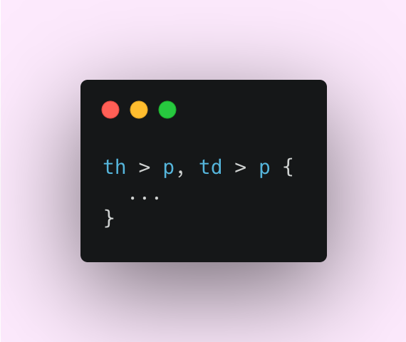
We’ve all been there, where we need to target a certain type of child element which may have multiple different parent elements, eg:
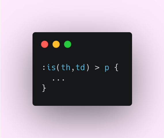
Well, times are-a-changin’. :is() is a CSS function that takes a comma-separated list of selectors, and acts as a shorthand way of selecting a certain child element – with any number of parent elements – to style (as seen in the example above). This is the way you would write the above CSS using :is():
One interesting thing to note is that if one of the items in the list of selectors you’re passing to :is() or :where() is invalid, the rest of the items will parse as normal and nothing will fail. Although it’s good to know that this currently isn’t as forgiving in Safari at the moment.
A great use case would be for styling deeply nested elements (eg. to change the font colour of multiple elements within a table).
Now, the syntax for both :is() and :where() is exactly the same, however, the difference between them comes down to specificity. :is() takes the specificity of its most specific argument, whereas :where() always has 0 specificity – similar to the universal selector (*).
Browser Support
Browser support isn’t too much of an issue with the :is() and :where() selectors. As with the previous feature, Internet Explorer isn’t (and probably will never be) supported.
Conclusion
It’s great to see these exciting new features coming to life and shows that some good things are on the horizon in the world of CSS. The potential of container query length units is huge in changing the way we write responsive code. On the same note, :is(), :where() and the use of gaps within flexbox make our work a lot easier and are definitely a step in the right direction. All in all, these are very positive changes and I look forward to seeing what else is to come.
If you haven’t already taken a look at my previous blog post about Design Systems with React and Storybook!
[ad_2]
Source link